Warehouse Closed On July 4th
My Favorite Color is Moda - Blocks 4 & 5
My Favorite Color is Moda - Blocks 4 & 5
Published:
Apr 6 2021 - 10:53
This April, we’re charging forward with Blocks 4 and 5 of the My Favorite Color is Moda quilt-along. If you haven’t joined yet, there’s still time to catch up; check with your local quilt shop for the pattern and any fabric or kits they’ve put together. We’ll be sharing a new block or blocks on the First Tuesday of every month for the rest of 2021.
Note: If you’re sewing ahead, check the end of this post for all current pattern corrections.
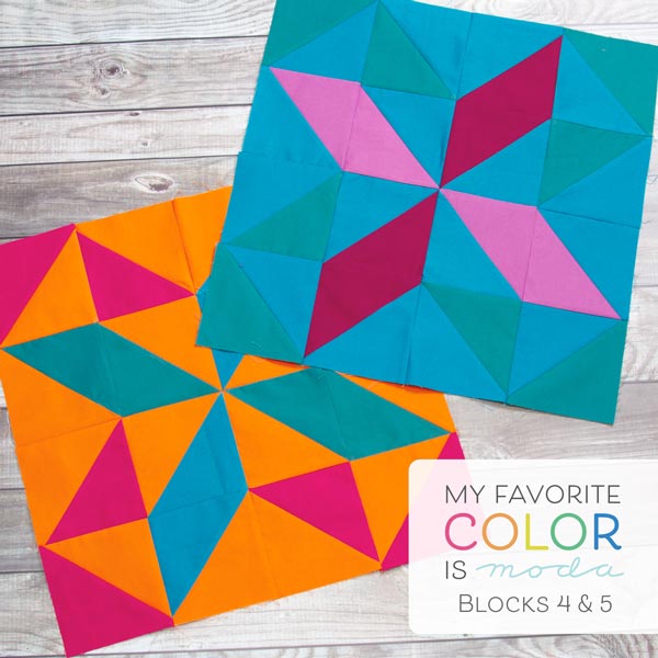
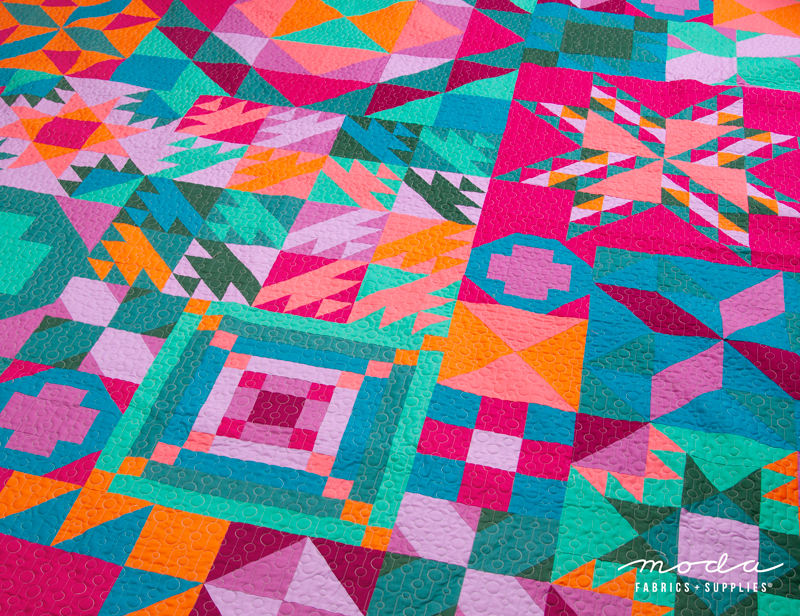
Our blocks this month feature the Tropical Getaway Bella Solids colorway. Everything about this color palette is lush and bold, full of the colors you would find in a tropical paradise.
Like last month, these two blocks are actually the same ‘block’, finished in two different fabric choices. For the first time in the sampler, these blocks only use a small selection of fabrics from the 10 in the project--and these blocks in particular present a great opportunity to take a closer look at contrast in your fabric selections.
What is contrast? In simple terms, contrast is best seen between two fabrics and how different or similar they are on a scale of light to dark. If one fabric is very light and the other is very dark, you would have high contrast between them. If both fabrics are of a similar lightness or darkness, you would see low contrast.
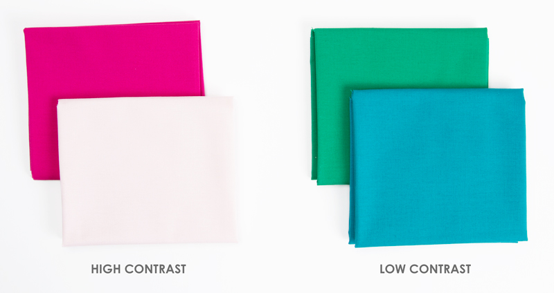
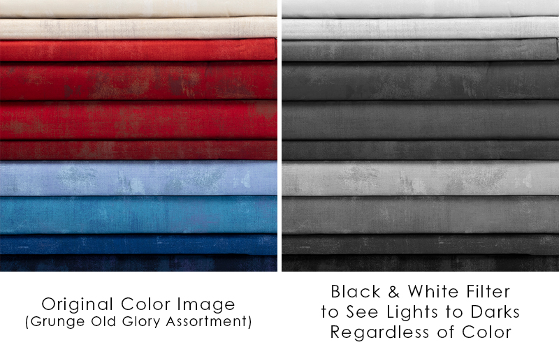
In any of your fabric pulls for projects, contrast is always a good thing to check before you start sewing. Love your fabrics but feel like something isn’t quite working? Check the contrast. An easy way to do this if you have a smartphone is snap a photo of your fabrics and change the filter to a black and white option--by removing the color, you can get a better idea of whether your fabrics are too contrasty or too similar, or just right where everything blends together with a good variation in light and dark. Like anything in quilting, there’s no right answer on contrast. It’s all about what you prefer!
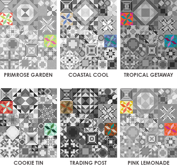
So why talk about contrast now? Among our Bella Solids colorways, there’s actually a range of contrast between the fabrics of each. Cookie Tin, Coastal Cool, and Trading Post have the highest contrast (meaning the most range from lights to darks).
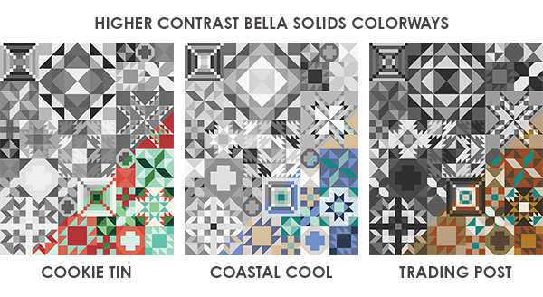
Primrose Garden and Pink Lemonade have more lights than darks compared to those first three, but still have a fair amount of contrast between the lighter colors and the darker ones.
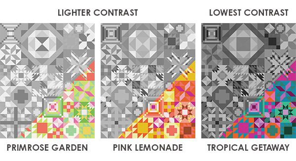
Tropical Getaway is unique--despite having probably the strongest color choices of all of the colorways, the contrast is actually fairly low, with most colors landing in a similar mid-tone gray when put in black and white. This low contrast is part of what makes the bold colors work so beautifully. Everything just FLOWS when the blocks are all assembled together, with no big visual jumps from light to dark in the quilt.
The same principle applies when you work with prints instead of solids. Have you ever considered making a low volume quilt? The low contrast between light prints is what helps everything flow. This low volume project by Brigitte Heitland of Zen Chic using her Modern Backgrounds fabrics is a perfect example.
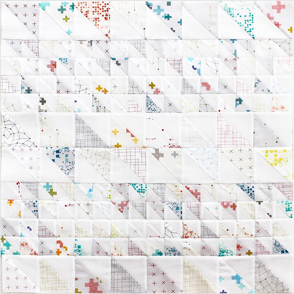
Photo from Brigitte Heitland's Instagram - @zenchicmoda.
Or, if you want to work with scraps, Plaidish by Erica Jackman of Kitchen Table Quilting (https://www.instagram.com/kitchentablequilting/) is a wonderful example of how to group your fabrics into lights, mediums and darks to use contrast as a main element of your design. Moda’s Lexi Hanson made a Plaidish quilt using all Ruby Star Society fabrics, and you can see how the variation in lights to darks is what truly creates the plaid look of the quilt.
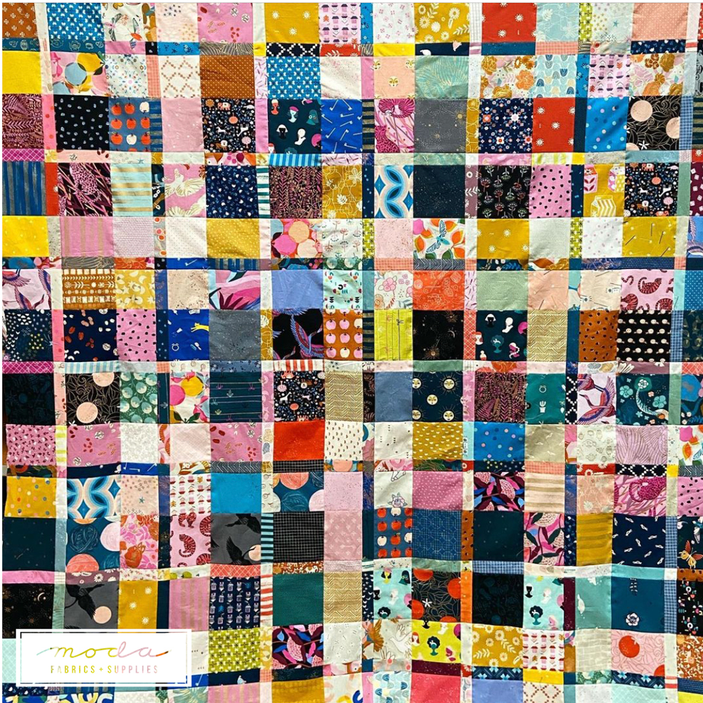
Photo from Lexi Hanson's Instagram - @lexiinstitches.
With that, enjoy sewing up your Blocks 4 and 5 during April!
Make sure to share your blocks on social media using #MyFavoriteColorIsModa this month so we can follow along with your progress. We’ll be sharing photos and blocks from the hashtag throughout the quilt-along.
For a PDF download of this post - My Favorite Color is Moda - Blocks 4 & 5
-----
MFCIM Pattern Correction Notes:
- BLOCK 17: In the ‘Piecing’ section, the third block pairing reads correctly that you should use Fabric 1 & 6 to make HST. However, the thumbnail image for the HST shows the incorrect fabrics, they should be the Green and Pink for Fabrics 1 and 6. All of the cutting instructions are correct for the block.
- BLOCK 18: In the ‘Piecing’ section, the thumbnail images for the block components are correct, but the fabrics listed for each are wrong. The first thumbnail needs Fabric 1 & 9, and the second thumbnail need Fabric 8 & 1. All of the cutting instructions are correct for the block.
- We will continue to list any pattern corrections in these blog posts for your reference.
Note: The instructions for cutting and making the My Favorite Color is Moda Sampler Quilt are in the Pattern Booklet - PS 9900 21 - available for purchase from your favorite quilt shop.
Posted in:
Comments